Building Your Store
Home Page Creation
The anatomy of a homepage that converts — brand story and products woven together so the customer always has a reason to stay and something to buy.
Watch the Video
Opens in Skool community
- The homepage sells your STORE — product pages sell individual products. The homepage gets people TO those product pages.
- Brand first, then products — every 1-2 sections about your brand are followed by products. The customer is never far from something they can buy.
- Each section has one job — build attention, interest, trust, or urgency. If it doesn't do one of these, it doesn't belong.
- This guide teaches the structure — the actual building happens in the Theme Editor using what you learned in the Theme Editor 2.0 guide
Why this matters
Most stores either dump a product grid ("Welcome to our store") or write a brand essay nobody reads. Neither converts. The structure below alternates between brand-building and product-showing — tell them something about you, then show them something they can buy. Two brand sections, then products. Repeat. By the time they scroll to the bottom, they trust your brand AND they've seen your products three times from three different angles.
1
The Template — What Goes Where
- Every high-converting homepage follows this rhythm: brand → brand → products → brand → brand → products. The products change — the rhythm doesn't.
- Yellow sections are products — they appear after every 1-2 brand sections so the customer always has something to buy.
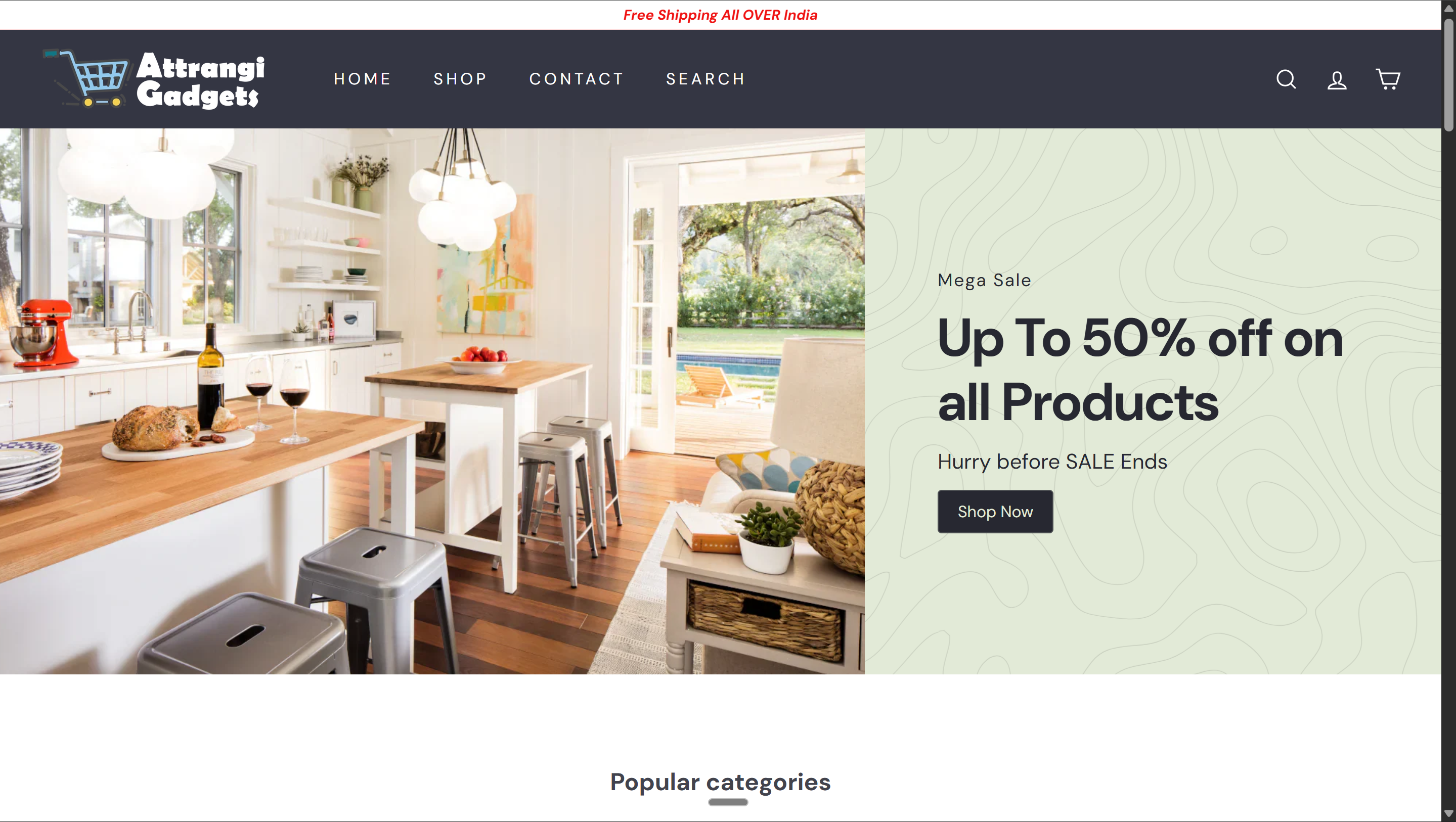
Announcement Bar
"Free Shipping All Over India" or your current offer. One line, max 10 words. Sets urgency before they see anything.
Hero Section
One bold headline (6 words max). One supporting line that tells them what you sell. One CTA button.
Shop Now
Trust Metrics Strip
3-4 proof points in a horizontal row. Real numbers — "10K+ Happy Customers", "4.8★ Avg Rating", "Easy Returns", "Results in 60 Seconds." Removes the first doubt before they scroll further.
10K+ Customers
4.8★ Rating
Easy Returns
Fast Delivery
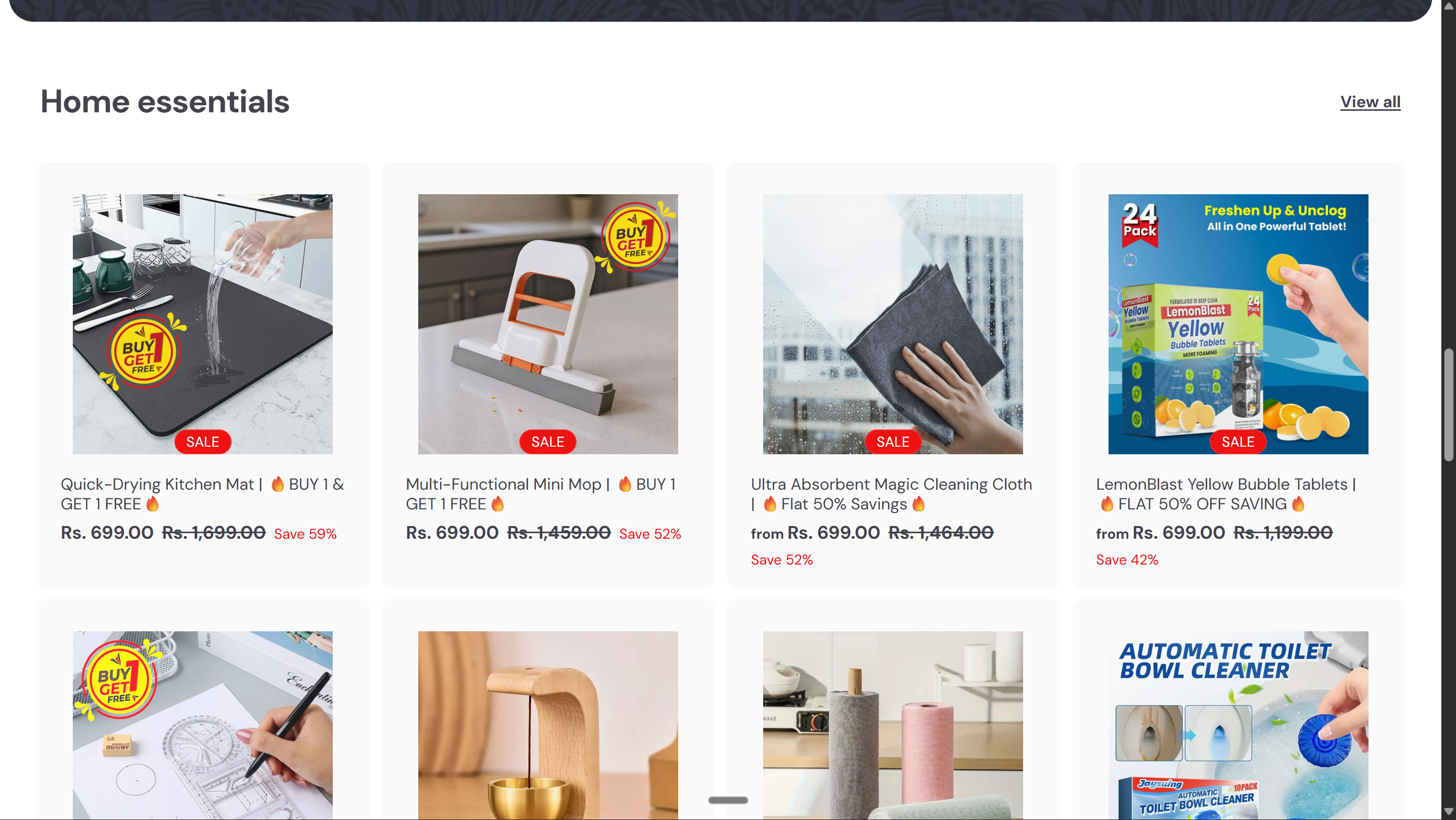
Best Sellers — Featured Collection
Your top 4-8 products. Image, title, price with strikethrough, Add to Cart. They know what you are + trust the numbers → now show them what they can buy.
Product
Product
Product
Product
How It Works / Brand Story
3-4 steps showing how your product or brand works. Dead simple — "Step 1: Choose. Step 2: Order. Step 3: Enjoy." Overcomes the "is it complicated?" doubt.
Step 1Choose
Step 2Order
Step 3Enjoy
Use Cases / Where It Works
Show your products in different contexts — rooms, outfits, occasions, routines. Image grid or tabs. Answers "will this work for ME?" by showing it in situations the customer recognizes.
Use Case 1
Use Case 2
Use Case 3
Use Case 4
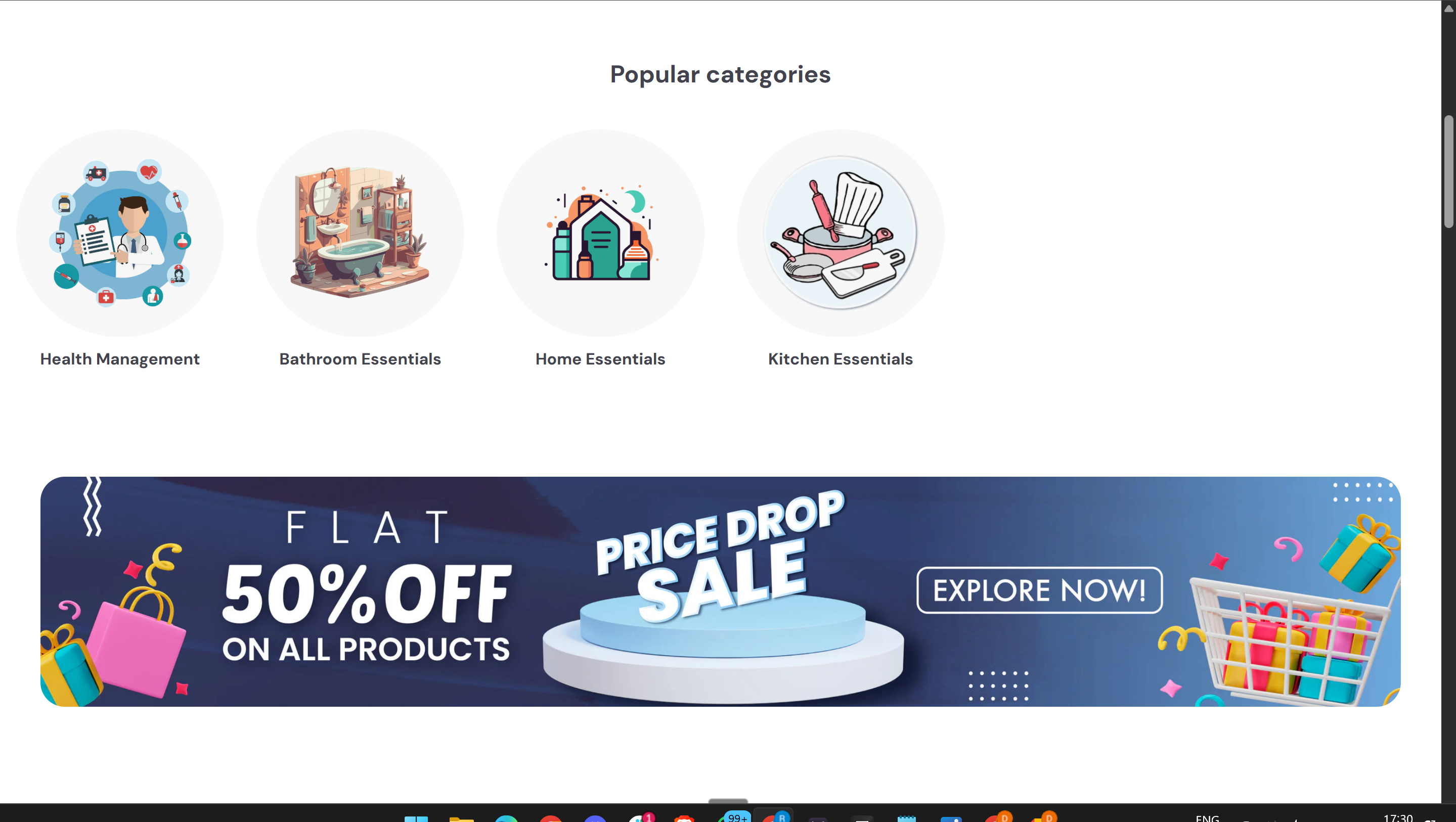
Category Collection — "Kitchen Essentials"
Products from a specific category. They now understand your brand and where your products fit → show them a focused collection. Different angle from best sellers above.
Product
Product
Product
Product
Reinforcement Banner
Your boldest brand claim — "India's #1 ____" or "Trusted by 10,000+ homes." Full-width graphic. Pattern interrupt after products — re-engages attention.
Shop Now — ₹ 499
Why Choose Us / Feature Deep-Dive
3-4 specific reasons to buy from you and not Amazon. Not generic ("quality products"). Specific to your niche — ingredients, technology, sourcing, expertise. The science behind your product.
🔬Feature 1
🛡️Feature 2
🌿Feature 3
⚡Feature 4
New Arrivals / Trending
Third product touchpoint. They trust your brand now → show fresh inventory. Returning customers see new things. Rotate this collection regularly.
Product
Product
Product
Product
Customer Testimonials
3-5 customer quotes with names and photos. Real reviews, real people. The visitor is interested but unsure — other people's words tip them over.
FAQ
5-6 questions: shipping, returns, payment, product quality, how to use. Last objection handler — answer it and they click a product.
Footer — policy links, contact, social media, payment icons
The rhythm: Brand → Brand → Products. Products appear 3 times — after trust metrics, after use cases, and after differentiators. The yellow sections are your revenue generators. The brand sections give customers a reason to buy before showing them what to buy.
2
The Psychology Behind the Layout
- The section order isn't random. It follows how humans build trust and make buying decisions — attention → proof → products → education → products → trust → products → validation
01
Announcement Bar → Urgency
First impression. The customer hasn't even seen your store yet. Sets the offer ("Free Shipping" / "FLAT 50% OFF") before they engage. Creates a reason to act NOW instead of "maybe later."
02
Hero → The 3-Second Test
"What does this store sell?" If your hero doesn't answer this in one glance, they leave. One bold headline (6 words max), one supporting line, one button. Trust indicators below (customer count, rating, returns) remove the first doubt before they scroll.
03
Trust Metrics → Proof Before Products
The customer just met you. Before they see products, they need a reason to take you seriously. Real numbers — "10K+ Happy Customers", "4.8★ Rating" — shift the mental frame from "random store" to "established brand." Now they're ready to browse.
04
Best Sellers → Show Winners Early
The customer came to buy, not to read your brand story. After 3 brand sections establishing who you are, show your top products immediately. Don't make them hunt. These are your proven sellers — highest conversion, most reviews.
05
How It Works → Remove Complexity
Some customers scrolled past the products — they're not ready yet. "Is this complicated? How does it work?" Show 3-4 dead-simple steps. Overcomes the friction of trying something new. Works for any niche — food, beauty, tech, cleaning.
06
Use Cases → "Will This Work for ME?"
The customer knows what you sell and how it works. Now they need to see it in THEIR context. Show your products in different rooms, outfits, routines, or situations. The more they see themselves in the images, the closer they are to buying.
07
Category Collection → Second Product Angle
After showing how and where your products fit into their life, show a specific category. Different products than best sellers — catches customers that the first set didn't hook. New options, new reasons to click.
08
Reinforcement Banner → Pattern Interrupt
After scrolling through products, attention drops. A bold full-width visual with your strongest brand claim re-engages them. "India's #1 ____" with a price-anchored CTA creates a new entry point. Some customers will buy from HERE — they didn't need the rest.
09
Why Choose Us → "Why Not Amazon?"
By now they've seen your products twice. The question shifts from "What is this?" to "Why buy from YOU and not Amazon?" Answer it with specifics — ingredients, sourcing, technology, founder story. Not "quality products." SPECIFIC to your niche.
10
New Arrivals → Third Product Touchpoint
They trust your brand. They understand your value. Show fresh inventory. This catches two audiences: first-timers who needed all the brand-building above, and returning customers who skip straight to "what's new."
11
Testimonials → Social Proof
The visitor is interested but unsure. Other people's words tip them over. Real names, real photos, specific quotes about what they bought and why they love it. "If Priya from Delhi bought this and loves it, maybe I will too."
12
FAQ → Last Objection
The last holdouts have one specific doubt — "What's the return policy?" "Is COD available?" "How long is shipping?" Answer it and they click a product. Don't answer it and they leave to "think about it" — which means they never come back.
The homepage is a funnel, not a gallery
Every section moves the customer one step closer to clicking a product. If a section doesn't build interest, trust, or urgency — remove it. 12 sections max. The brand sections EARN the right to show products. The product sections CONVERT the trust the brand sections built.
3
A Live Homepage — Executed
- Here's a real store following this exact rhythm — hero, trust metrics, products, brand story, more products
Announcement bar (offer) → Hero banner with bold headline → "Shop Now" CTA → Trust metrics below
Live Store
Use cases (where the product works) → Promotional banner (pattern interrupt with brand claim)
Live Store
Product collection — image, title, price with strikethrough, sale badge. Products appear AFTER the brand-building sections above.
Live Store
4
Theme Editor — Section Mapping
- Open the Theme Editor and make sure you're on the Home page in the top dropdown
- Each template section maps to a specific Theme Editor section. Add them in order using "Add section."
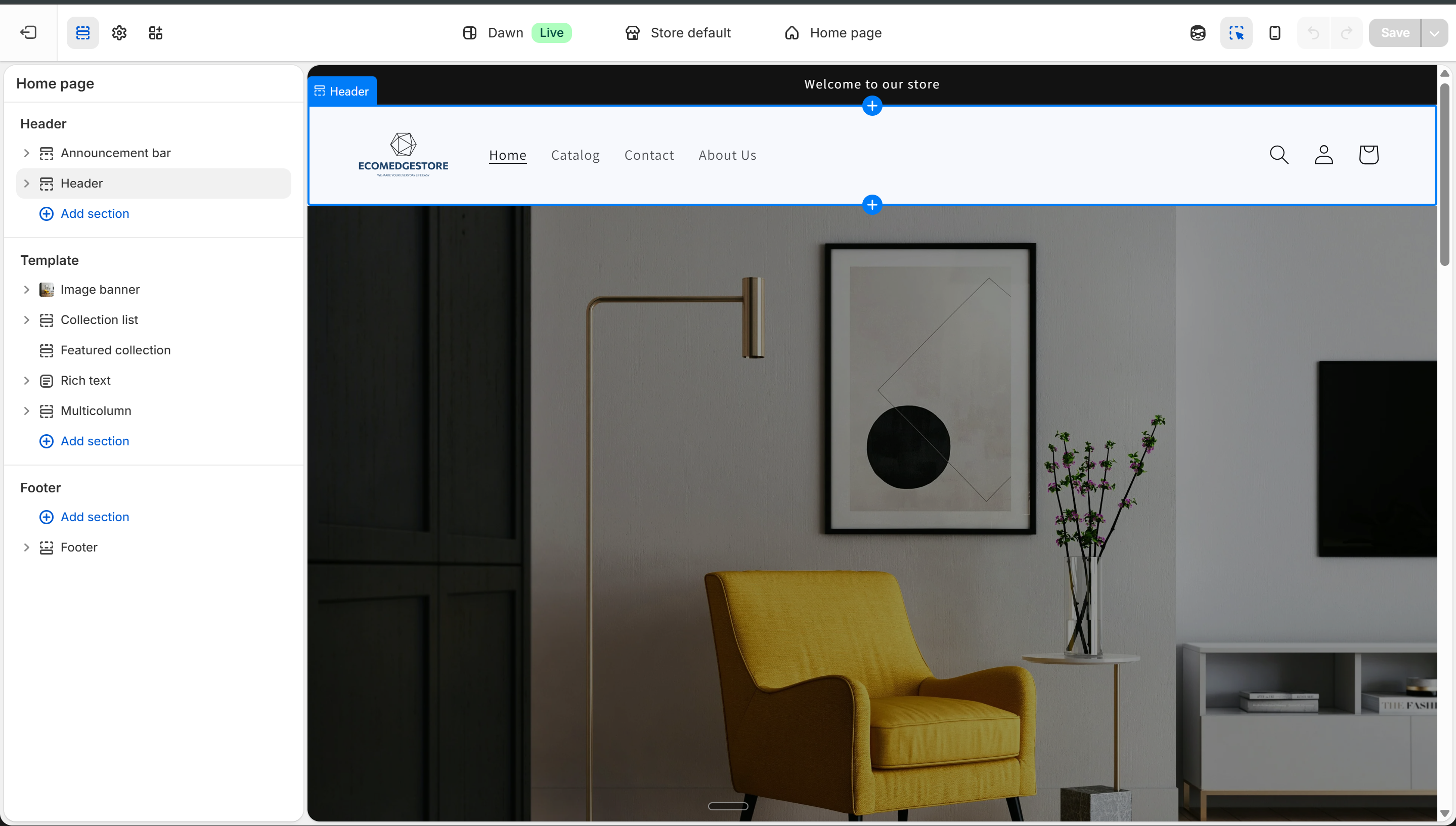
Theme Editor — homepage sections: Image banner, Featured collection, Rich text, Multicolumn, Collapsible content
Theme Editor
Hero → Image bannerFull-width image with headline overlay and CTA button.
Trust Metrics → Multicolumn3-4 columns with icon + number. One per metric. Keep it tight — numbers, not sentences.
Products → Featured collectionLinks to a collection. Add multiple — one per product section (Best Sellers, Category, New Arrivals).
How It Works → Multicolumn3-4 columns with step number + text. Or use Image with text for a visual walkthrough.
Use Cases → Image banner or Collection listGrid of lifestyle images showing your products in different contexts. Or tabbed collection list.
Reinforcement → Image bannerSecond image banner. Bold graphic with your biggest claim + CTA with price.
Why Us → Multicolumn3-4 columns with icon + text. One specific differentiator per column.
Testimonials → Rich textCustomer quotes. Or use your review app's homepage widget for auto-display.
FAQ → Collapsible contentAccordion Q&A. Each row is one question.
Footer → FooterAlready exists. Add policy links, social, payment icons.
Remember the circuit. Every Featured Collection must link to a real collection with products. Every Image banner needs images uploaded. Empty sections = blank spots on your homepage. Build the collections first, then link them.
5
Use AI — But Make It Yours
- The template tells you what goes where. AI writes the actual copy — headlines, descriptions, FAQ answers, trust metrics.
- The prompt below asks about YOUR brand before writing anything — so every output is different.
- The Ads Library test: if a competitor checks Meta Ads Library and your homepage looks like 10 other stores — the copy isn't unique enough. The structure can be similar. The voice must be yours.
Paste the prompt into Gemini, ChatGPT, or Claude — it generates content tailored to YOUR brand
Gemini
AI Prompt — Homepage Content
I'm building the homepage for my Indian e-commerce store. Before writing anything, ask me these questions so you understand my brand:
1. What does my store sell? (niche, product types, number of products)
2. Who is my target customer? (age, gender, lifestyle, what problem they have)
3. What makes my store different from Amazon/Flipkart? (speed, quality, curation, price, expertise, ingredients, technology)
4. What is my brand personality? (fun, premium, minimal, bold, earthy, technical, friendly)
5. What offer am I running right now? (discount, BOGO, free shipping, bundle)
6. What's the one thing I want a visitor to FEEL when they land on my homepage?
7. How does my product work? (3-4 simple steps a customer would follow)
8. Where or when would someone use my products? (rooms, occasions, routines, situations — give 4-5 examples)
After I answer, generate homepage content for each section in this exact order:
ANNOUNCEMENT BAR — one line, max 10 words. Best offer or shipping promise.
HERO SECTION
- Headline (max 6 words, memorable, not generic — think "One foam. Every room." or "Your skin. Our science.")
- Supporting line (max 20 words — what you sell + why it matters)
- CTA button text
- 3-4 trust indicators with specific numbers (e.g., "10K+ Happy Customers", "4.8★ Avg Rating")
HOW IT WORKS — 3-4 dead-simple steps. Each step: one-word title + one-line description. Make it sound effortless.
USE CASES — 4-6 situations where the customer would use my products. Each one: short label + one sentence. These become image labels on the homepage.
REINFORCEMENT BANNER
- Bold brand claim (max 8 words — "India's #1 ____" or similar)
- One supporting line
- CTA button with price
WHY CHOOSE US — 3-4 specific differentiators. NOT generic ("quality products"). Each one: headline + 2 lines explaining why this matters to the customer.
FAQ — 5 questions my customer would actually ask before buying. Product-specific, not generic policy questions. Include answers.
Rules:
- Headlines: 3-6 words max. If I can't say it in one breath, it's too long.
- "Premium quality" and "best in class" are banned. Be specific or don't say it.
- Tone must match MY brand. Ask me first, don't assume.
- Two stores using this prompt must produce completely different output.
- The trust metrics must use MY real numbers. If I don't have numbers yet, tell me to use "100+" as a starting point and replace with real data within 30 days.
- Think about what makes someone STOP scrolling. Surprise them.
Always edit the AI output
AI gives you the first draft. Replace generic claims with real numbers (your actual shipping time, your real review count, your real customer count). Change the tone to match your brand. If it sounds like it could belong to any store — rewrite it.
Homepage Checklist
"Welcome to our store" fails. Your headline should name what you sell or the benefit you deliver. Test: read it aloud. If someone can't tell what you sell, rewrite it.
The customer needs a reason to take you seriously before you show them products. "10K+ Happy Customers" and "4.8★ Rating" turn a random store into a credible brand. No numbers yet? Start with "100+ Happy Customers" and update with real data as you grow.
The customer came to buy. Products should be visible right after the trust metrics — don't bury them under content. Hero → Trust Metrics → Products. Three sections before the first product grid.
Each brand section should answer a specific question: "Who are you?" (hero), "Can I trust you?" (metrics), "How does it work?" (process), "Will it work for me?" (use cases), "Why not Amazon?" (differentiators). If a section doesn't answer one of these — remove it.
Check Theme Editor > each Featured Collection > which collection is linked. Verify it has products. Empty = blank section on your homepage. You need at least 3 collections: Best Sellers, one category, and New Arrivals.
Search your niche in Meta Ads Library. If your headlines sound like 10 others — rewrite. Structure can be similar, voice must be yours. The "How It Works" and "Why Choose Us" sections are where your uniqueness shows.
80%+ of traffic is mobile. Preview in Theme Editor (phone icon). Hero readable? Trust metrics stack properly? Products visible? CTA buttons tappable? The reinforcement banner should still be bold on mobile — not tiny text on a huge image.